Clarence St Ash Study
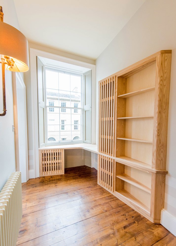
We recently had the opportunity to create this unique and eye-catching study desk for an eclectic New Town apartment.
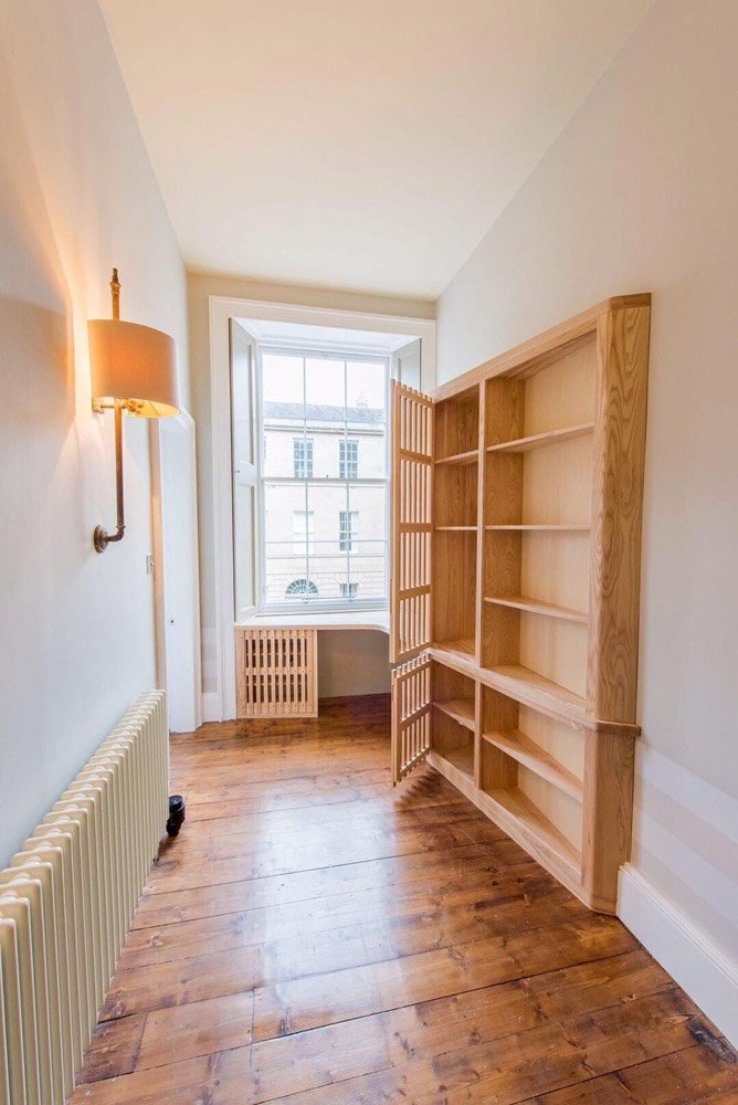
The room was narrow in width, with a three metre tall ceiling and a large bay window. Using a standard shelving solution would be too bulky and would rudely protrude into the room. With such pleasant light coming from the window our clients wanted to utilise it with a piece which allowed the light in, not block it out.
During our a site visit we had a lengthy discussion about how the design would translate into solid wood. “We like the idea of the contrast on a lighter wood structure.”
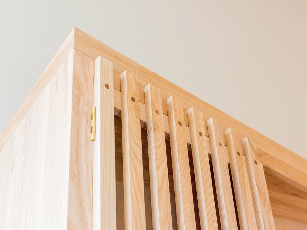
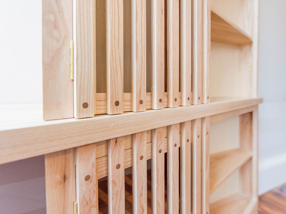
This prompted us to suggest using a subtle Ash as the main feature wood with Walnut accents in places in the form of circular plugs on three slatted doors. What is often not realised when the initial design is drawn, is the grain of the wood and how it vastly impacts the overall look of the piece. The end closest to us is a taper, which then becomes a smooth curve before angling back into the wall. This piece was actually constructed from three pieces of wood, with particular attention being paid to making the grain flow seamlessly between the pieces so that when we shaped the curve and 63.5 degree angle into it, the wood would simply appear as one piece rather than 3 joined pieces! It is the small details like this which makes or breaks the piece.
There were some practicalities which had to be considered. The smallest part of the desk on the left had to accommodate a pre existing hifi system and the internal shelving behind the slatted doors had to be fully adjustable to allow larger items inside. The desk top itself is a multi piece worktop comprising of 3 beautifully grain matched parts which join together to harmoniously tie into the rest of the piece which also has three components.
Another practicality was that this study had to be used for computer work. This meant that on site we selected areas of the worktop and cabinetry to place cable holes into, to allow cables to stay as hidden from the view as possible, while also giving access to sockets for lights etc.
Unique details which make us happy.
The slatted doors give the user a sense of space, they don’t impede into the space. The boards we used for these vertical slats were carefully selected in the workshop where we meticulously marked and aligned the pieces so that, when each board was split down the middle to create two pieces, the grain flowed from one piece to the next. This process is called Bookmatching.
We utilise Bookmatching in almost all of our work whether it be small pieces like these components, or the front panels of solid wood doors with much larger expanses to cover.
The finish. For household furniture we use a variety of finishes with most of them being within the eco friendly Osmo Oil range. On this study we spoke at great length with clients about what final finish they wanted for the piece. We provided samples in the chosen Ash with satin clear, transparent raw, and a danish oil finish. It came down to transparent raw where the properties of the finish suited the build perfectly.
The finish itself has white pigment in it, causing it to interact well with white ash. Almost any other finish would cause a gradual yellowing of the wood whereas the transparent raw will keep this piece the same colour throughout the decades of use.


